
What is the Consumer Price Index and How is it Calculated
A clear breakdown of how Malaysia’s CPI tracks everyday prices and why economists rely on this measurement.
Read MoreWhen you read that inflation is up by 2.5%, what does that really mean? We’ll walk you through reading inflation reports and understanding what the numbers tell us about the economy.

Inflation affects everything you do. When prices rise, your money buys less at the grocery store. Your rent might jump. Your salary might not keep up. But here’s the thing—understanding inflation reports helps you see what’s actually happening with the economy, not just what you feel in your wallet.
Economic reports aren’t written in code. They’re just data organized in specific ways. Once you know how to read them, you’ll spot patterns and trends that most people miss. You’ll understand whether prices are rising fast or slow, and you’ll get context for decisions about saving, spending, and planning ahead.

Let’s start simple. Inflation is the rate at which prices for goods and services increase over time. When inflation is 2.5%, that means the average price of things went up 2.5% compared to last year. A coffee that cost RM5 last year now costs roughly RM5.13. It sounds small, but it adds up across your entire spending.
The Consumer Price Index—or CPI—is how statisticians measure inflation. They track prices for hundreds of everyday items: food, housing, transport, utilities, entertainment. They’re not measuring luxury goods or one-off purchases. They’re watching what ordinary people actually buy week to week. The CPI tells you whether the cost of living is rising, falling, or staying stable.
Economic reports follow a standard format. Once you know what to look for, you’ll navigate them easily.
The first thing you’ll see is the headline inflation rate. This is the year-over-year percentage change in CPI. It’s usually in a prominent box or the opening paragraph. For Malaysia, this number gets released monthly by the Department of Statistics. It tells you the overall inflation rate across all goods and services measured.
Don’t stop at the headline. Reports break inflation down by category: food, housing, transport, healthcare. Some categories might be rising 5% while others rise 1%. This tells you where price pressure is strongest. If food inflation is 6% but energy is 0.5%, you know groceries are driving the overall number, not fuel prices.
Reports show two comparisons: year-over-year and month-over-month. The year-over-year is better for spotting long-term trends. Month-over-month is noisier but shows recent momentum. If inflation was 2.5% last month and 2.7% this month, it’s accelerating slightly. That matters to economists and central banks.
Core inflation excludes volatile items like food and energy. Headline inflation includes everything. Economists watch both because food and fuel prices swing wildly based on weather, global events, or supply shocks. Core inflation is steadier and shows underlying price trends. If headline inflation is 3.5% but core is 2.1%, volatile items are driving the spike, not structural economic pressure.

Numbers by themselves don’t mean much. You need context. A 3% inflation rate sounds different if you’re comparing it to last month’s 1% versus last year’s 4%. You need to see the trend. Is inflation accelerating or cooling? Is it moving toward the central bank’s target, or away from it? That’s what tells you the real story.
A 2.5% inflation rate might be considered low in one economic environment and high in another. If the central bank’s target is 2%, then 2.5% shows prices rising slightly above goal. If the economy has been running 4-5% inflation, then 2.5% shows prices cooling down. You can’t judge a number in isolation—you need the surrounding story.
When you read an inflation report, ask yourself: Is this faster or slower than last month? Is it higher or lower than a year ago? Are specific categories driving the change, or is it broad-based? What does this mean for people’s purchasing power? These questions help you move from numbers to understanding.

Here’s how to approach inflation reports like someone who actually understands them.
Don’t dive straight into tables. Most reports have an executive summary that explains what changed and why. It’s written for people like you, not just economists.
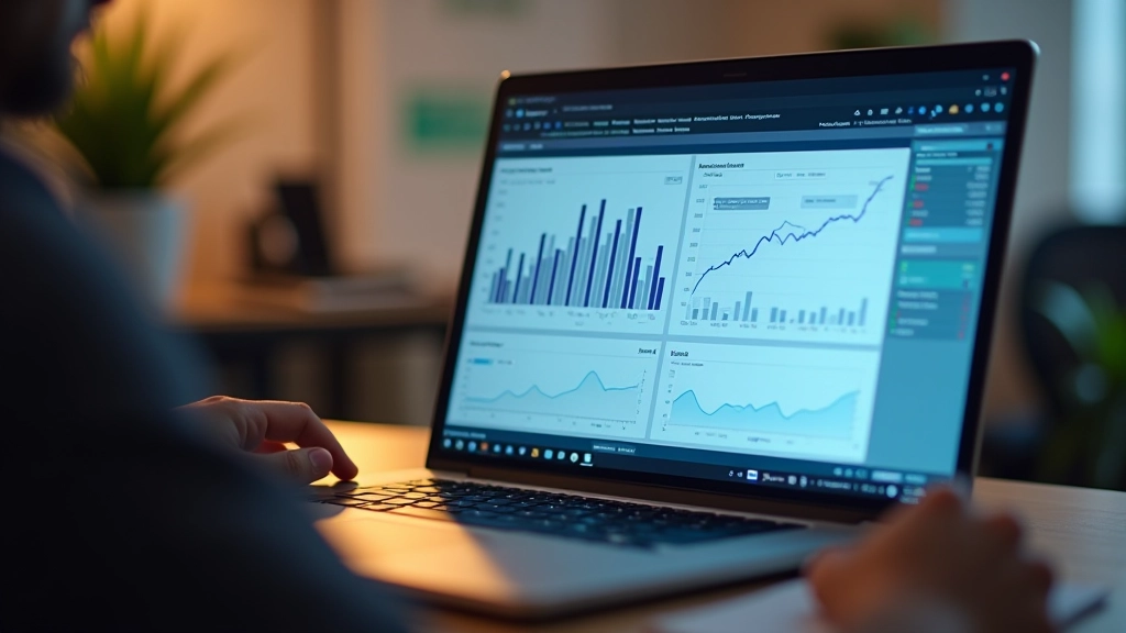
Charts show trends visually. A line going up shows accelerating inflation. A flat line shows stable prices. You’ll understand the story faster from a chart than from numbers alone.
Keep the last 3-6 months of reports nearby. You’ll spot patterns. Is inflation trending up, down, or sideways? That matters more than any single number.
If you’re worried about housing costs, find the shelter category. If groceries concern you, look at food. You don’t need to understand everything—focus on what affects you.
After the data, reports often include analysis. Economists explain what surprised them, what changed, and what it means. This context is gold.
Reports note whether numbers are seasonally adjusted. This removes expected seasonal price swings (like summer fuel prices). Adjusted numbers show the real underlying trend better than raw data.
You don’t need to be an economist to understand inflation reports. You just need to know what to look for.
Inflation measures how fast prices are rising. CPI is the tool used to track it. These numbers affect your purchasing power and financial planning.
Start with the headline number, then look at the breakdown by category. Food inflation and energy inflation tell different stories than headline inflation.
Context matters. You need to compare this month to last month, last year, and the trend over time. One data point doesn’t tell the story—the pattern does.
Core inflation (excluding volatile items) shows underlying trends. Headline inflation includes everything. Economists watch both for different reasons.
Now when you see an inflation report, you’ll know exactly what to look for. You’ll understand the numbers, the trends, and what they mean for your wallet. That’s real financial literacy—not memorizing formulas, but understanding what the data is actually telling you about the economy.


This article is for educational purposes only and provides general information about inflation and economic reports. It isn’t financial advice, and circumstances vary by individual. The information presented reflects general economic principles and doesn’t constitute professional guidance. Always consult with qualified financial advisors or economists for decisions specific to your situation. Economic data and interpretations change over time, and historical patterns don’t guarantee future results.